| |
RE: How do I change the bar chart to scatter format?
|
| |
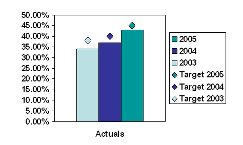
By changing the data layout and
using stacked columns instead of clustered you can get the
target markers to align with each column.
|
With 3 data series plotted as
a clustered column chart and 3 more plotted as line series the
line markers are all plotted central to the column cluster.
You can not use the xy
scatter chart instead of lines as the combination is not
permitted.
|

 |
| |
|
By altering the layout of the
data and changing the column chart to be stacked instead of
clustered you can get the line marker to be aligned over each
column.
Note the use of empty columns
A and E in the data sheet.
|

 |
|
|
You can further enhance the
look by setting the Gap Width to zero.
The order of the legend can
also be changed by reordering the information in the datasheet.
|
 |
|
|
|
 AJP Excel Information