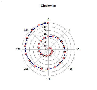
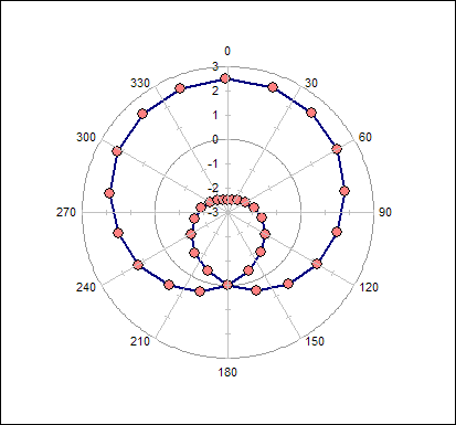
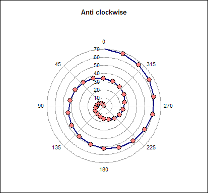
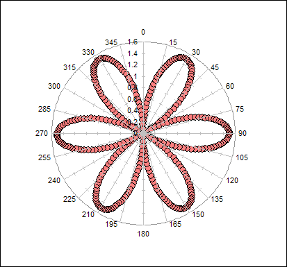
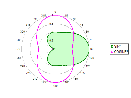
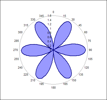
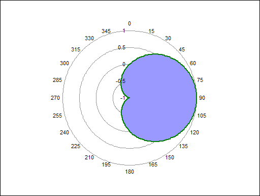
The polar plot
is created using the Radar chart.
This particular example requires 2 data series in order to
generate the spiral effect.
The angle and distance data is stored in a table with a named
range. The radar chart has a point of each of the 360 degrees.
Which points are plotted is determined by using a VLOOKUP
function. For angles that are not contained within the data
table the effect of the plot can be altered by charting either a
zero or a #N/A.
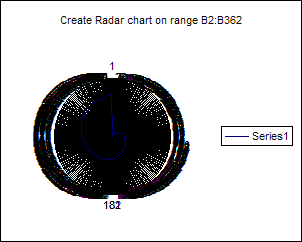
In the example workbook is a
sheet containing data in order to build the following example
Create a standard radar chart
based on the 360 angles, which are contained in the range
B2:B362
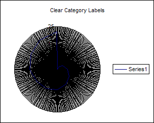
Clear the Category labels
from the chart
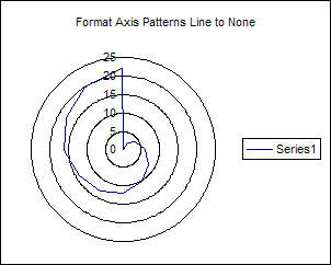
Remove all the lines by
formatting the axis and setting the Line to None
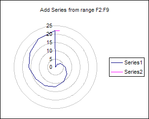
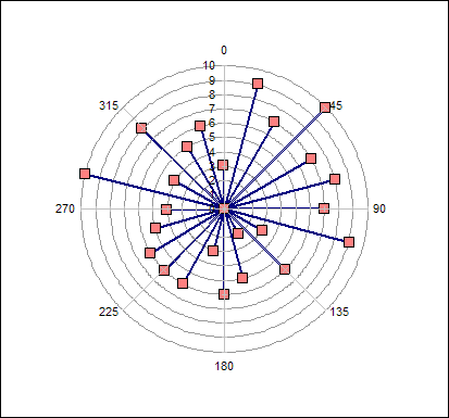
To construct the angle axis
use a dummy data series. Add the information in range F2:F9 to
the chart
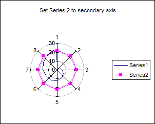
Move the dummy data series to
the secondary axis
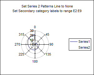
You can set the Line pattern
to None on the dummy series to make in invisible.
Set the secondary axis category labels to the range E2:E9
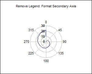
Remove the legend and format
the secondary axis as requried
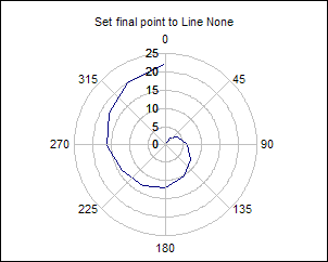
Depending on the plot you may
wish to set the final points line style to None in order to
remove the connecting line back to the zero.
To do this select the series and then use the right arrow to
cycle through the points in the series. On the last points
format the line to None.

 AJP Excel Information