

| |
| |
Re: Colors of columns after sorting data in the supporting
table
|
| |
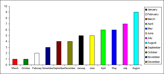
The chart contains 12 series
instead of 1 and the values within each series are controlled
via worksheet formula. Only 1 value from each series is actual
displayed.
The original data can then be
sorted and the x axis labels and the column values will alter.
But the colour associated with each month will remain constant.
This
workbook contains an example.
|
| |
|
|
|
|
|
|
Created August 2004
Last updated 5th August 2014
 AJP Excel Information