

| |
| |
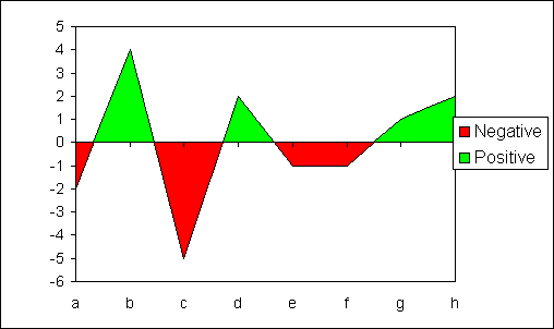
RE: How to vary color in an area chart between negative or
positive
|
| |
The area chart has 2 data
series.
The negative series is created directly from the original data.
The positive data series is derived via formula from the
original data and plotted on the secondary x-axis.
You can not simply use 2
series plotting on positive or negative values as this do not
create the same x-axis crossing points as a single set of data.
The formula for the positive
series calculates the x-axis crossing points. To plot these
values correctly the secondary axis is changed to a date value
rather than category value axis. In this example I used 100 days
between category points.
This workbook
contains an example.
|
| |
|
|
|
|
|
|
Created August 2004
Last updated 5th August 2014
 AJP Excel Information