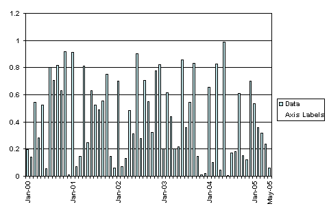
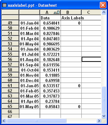
You can use the
data labels of an additional data series to mimic the x-axis
labels.
The labels displayed are controlled simple by entering a value
in column B of the data sheet.
Select the 'Axis Labels'
series in the chart and change the chart type to Line.
Add data labels displaying the Category value.
Format the data labels to be positioned Below and change the
alignment.
Format the series line to have no border or markers.
You will also
have to format the x axis to remove the tick labels.
 AJP Excel Information