Make X axis labels display below negative data
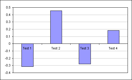
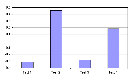
When plotting negative values the axis labels can get obscured by the chart content.
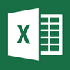
Double click the x axis to display the Format dialog.
xl2003 dialog
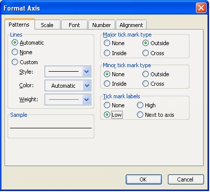
xl2010 dialog
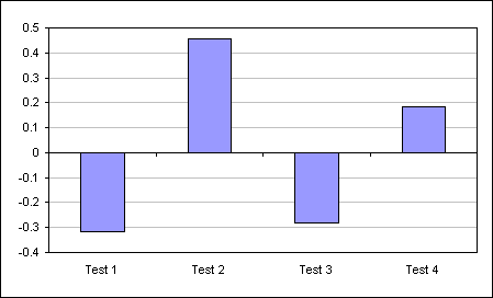
To make the axis labels display outside of the plot area set the Tick mark labels to Low.
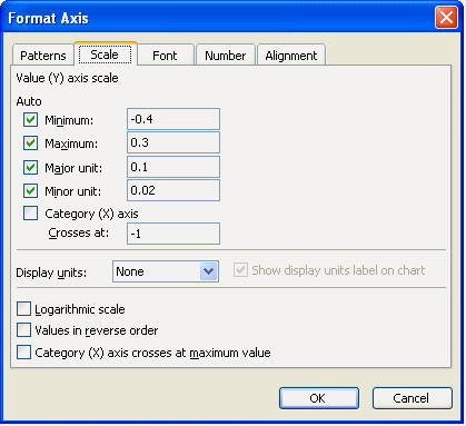
An alternative is to set the value at which the axis crosses the Y axis to a value less than or equal to the smallest value in your data.
Double click the Y axis to get the Format dialog and then change the Category (X) axis Crosses at: value.
In this example you can see I have used a value much less than the actual data in the chart.
Be aware that the effect on the chart is very different that the Low labels method.
Notice the bars originate from the base of the chart and NOT the value zero.