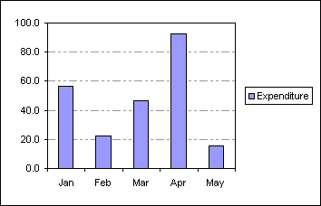
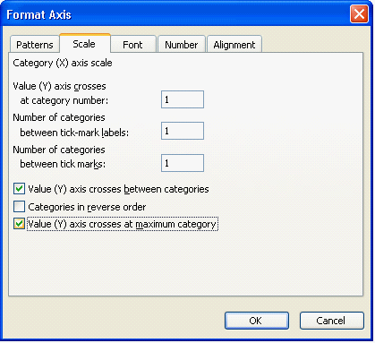
Displaying Y axis values on the right of the plot area
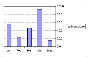
| A | B | |
| 1 | Expenditure | |
| 2 | Jan | 56.3 |
| 3 | Feb | 22.3 |
| 4 | Mar | 46.4 |
| 5 | Apr | 92.7 |
| 6 | May | 15.5 |
 AJP Excel Information


| A | B | |
| 1 | Expenditure | |
| 2 | Jan | 56.3 |
| 3 | Feb | 22.3 |
| 4 | Mar | 46.4 |
| 5 | Apr | 92.7 |
| 6 | May | 15.5 |