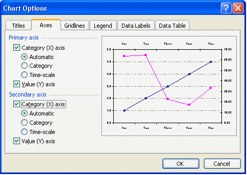
Displaying the secondary X axis
Whilst the secondary Y (value) axis appears automatically when a data series is placed on the
secondary axis the secondary X (category) axis requires you to enable it.
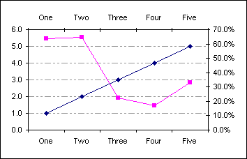
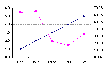
Create a standard line chart based on the data in A1:C6
| |
A |
B |
C |
| 1 |
|
Rating |
Percentage |
| 2 |
One |
1.0 |
63.5% |
| 3 |
Two |
2.0 |
64.7% |
| 4 |
Three |
3.0 |
22.4% |
| 5 |
Four |
4.0 |
17.1% |
| 6 |
Five |
5.0 |
33.1% |
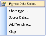
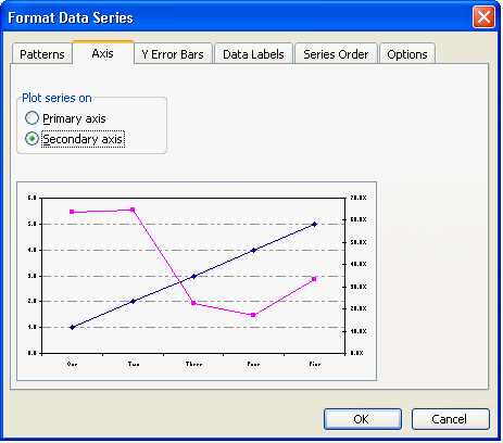
Select the 2nd data series, right click and from the popup menu choose Format Data Series...
On the format dialog choose Axis and then Plot series on secondary axis
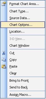
The secondary Y (value) axis is displayed automatically. To enable the secondary X (value) axis right click the
chart and from the popup menu choose Chart Options...
On the Axes tab of the Options dialog enable the secondary Category axis