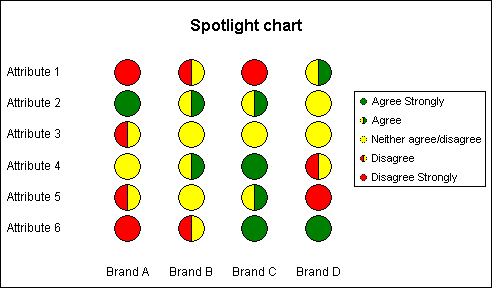
The chart displays a matrix.
The marker represents the value at each intersection.
At first glance this chart
may appear very similar to the
Tile chart and to some extent it is.
But this chart uses a different approach to the construction of
axis labels, markers and the conditional formula.
The chart is based on a
XY-Scatter with series used to provide axis labelling and the
spots. The chart uses data from conditional formula in order to
display a single spot in each position.
The
workbook contains a step by
step explanation on how to construct the chart.

 AJP Excel Information