| |
| |

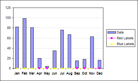
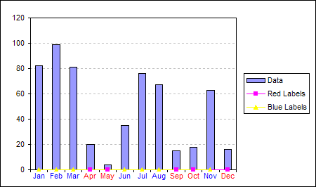
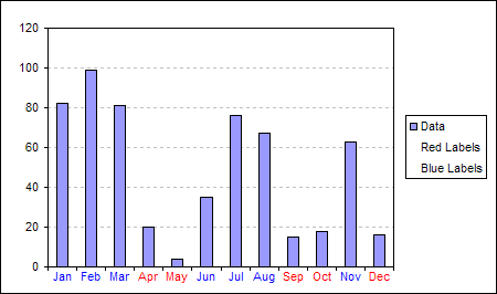
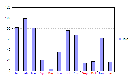
The above chart
high lights the X axis category labels when the monthly data
drops below 25.
This effect is achieved by using the data labels of 2 extra data
series, plotted as lines.
|
|
| |
| |
Here is the data and formula
used to build the chart. The actual data for the column chart is
in the range C3:C14.
The formula in columns D and E test the Data value and either
output a zero or #N/A depending on whether a red or blue label
should be displayed.
| |
B |
C |
D |
E |
| 2 |
|
Data |
Red Labels |
Blue Labels |
| 3 |
Jan |
82 |
=IF(C3<25,0,NA()) |
=IF(C3>=25,0,NA()) |
| 4 |
Feb |
99 |
=IF(C4<25,0,NA()) |
=IF(C4>=25,0,NA()) |
| 5 |
Mar |
81 |
=IF(C5<25,0,NA()) |
=IF(C5>=25,0,NA()) |
| 6 |
Apr |
20 |
=IF(C6<25,0,NA()) |
=IF(C6>=25,0,NA()) |
| 7 |
May |
4 |
=IF(C7<25,0,NA()) |
=IF(C7>=25,0,NA()) |
| 8 |
Jun |
35 |
=IF(C8<25,0,NA()) |
=IF(C8>=25,0,NA()) |
| 9 |
Jul |
76 |
=IF(C9<25,0,NA()) |
=IF(C9>=25,0,NA()) |
| 10 |
Aug |
67 |
=IF(C10<25,0,NA()) |
=IF(C10>=25,0,NA()) |
| 11 |
Sep |
15 |
=IF(C11<25,0,NA()) |
=IF(C11>=25,0,NA()) |
| 12 |
Oct |
18 |
=IF(C12<25,0,NA()) |
=IF(C12>=25,0,NA()) |
| 13 |
Nov |
63 |
=IF(C13<25,0,NA()) |
=IF(C13>=25,0,NA()) |
| 14 |
Dec |
16 |
=IF(C14<25,0,NA()) |
=IF(C14>=25,0,NA()) |
|
|
|
 |
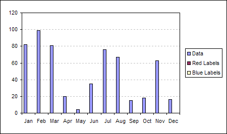
Select the range B2:E14 and
use the chart wizard to build a standard Clustered Column chart.
|
|
|
|
 |
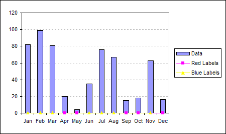
Select the 'Red Label' line
and right mouse click. From the popup menu choose Chart Type.
Select the Line chart.
Repeat for the 'Blue Label'
series
|
|
|
|
 |
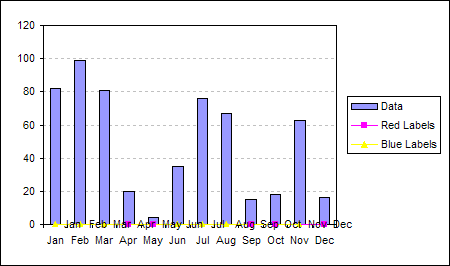
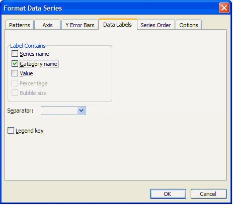
Double click the 'Red Labels'
series and on the Data Labels tab of the Format Data Series
dialog check the Category name option.
|
|
|
|
 |
Repeat the application of
data labels for the 'Blue Labels' series
|
|
|
|
 |
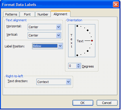
Double click the 'Red Labels'
data labels and on the Alignment tab of the Format Data Labels
dialog set the Label Position to Below.
|
|
|
|
 |
Repeat data label label
position for the 'Blue Labels' series.
|
|
|
 |
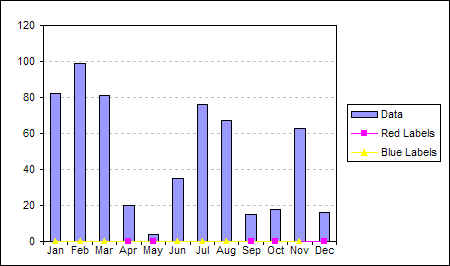
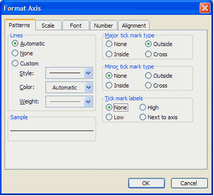
Double click the X axis and
on the Patterns tab of the Format Axis dialog set the Tick Mark
Labels to none.
This will clear the built-in
axis labels.
|
|
|
 |
|
|
|
|
 |
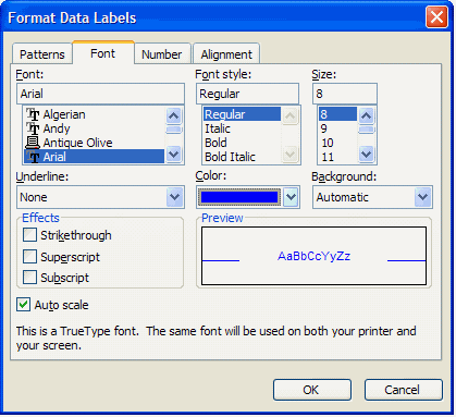
Double click the 'Red Labels'
data labels and on the Font tab of the Format Data Labels dialog
set the Font Colour to Red.
|
|
|
|
 |
Repeat for the 'Blue Labels'
data labels. Setting the Font Colour to Blue.
|
|
|
|
 |
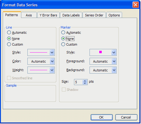
Double click the 'Red Labels'
data series and on the Patterns tab of the Format Data Series
set the Line and Marker to None.
|
|
|
|
 |
Repeat for the 'Blue Labels'
series.
|
|
|
|
|
|
|
|
|
|
|
|
|
