| |
|
| |
This example
uses a dummy data series to plot the category name either side
of the axis depending on whether the bar is positive or
negative.
|
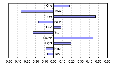
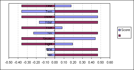
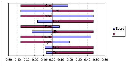
Create a bar chart on the
data in the range A1:B11
As you can see the category labels on the negative side of the
axis are obscured by the bars.
For this example I have
already reversed the plot order of the bars to match that of the
data, see here for details
|
| |
A |
B |
C |
| 1 |
|
Score |
|
| 2 |
One |
0.18 |
-0.36 |
| 3 |
Two |
-0.36 |
0.47 |
| 4 |
Three |
0.47 |
-0.36 |
| 5 |
Four |
-0.17 |
0.47 |
| 6 |
Five |
0.08 |
-0.36 |
| 7 |
Six |
-0.23 |
0.47 |
| 8 |
Seven |
0.44 |
-0.36 |
| 9 |
Eight |
0.20 |
-0.36 |
| 10 |
Nine |
-0.09 |
0.47 |
| 11 |
Ten |
-0.07 |
0.47 |
|
|
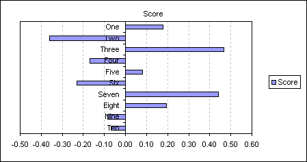
One possible way around this
is to set category axis tick mark labels to the Low position.
|
|
|
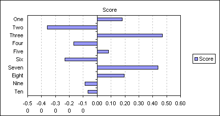 |
But to keep the text next to
the axis whilst not being obscured by the bars you can do the
following.
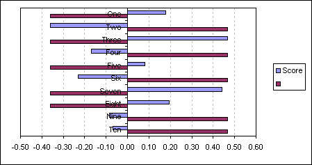
Add the following formula to
C2: =IF(B2<0,MAX($B$2:$B$11),MIN($B$2:$B$11))
and then copy down to C11. Add
this new data series to the chart.
|
|
|
 |
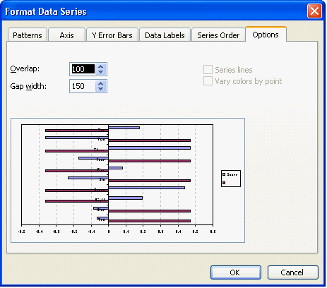
Double click either series
and change the Overlap value to 100
|
|
|
 |
|
|
 |
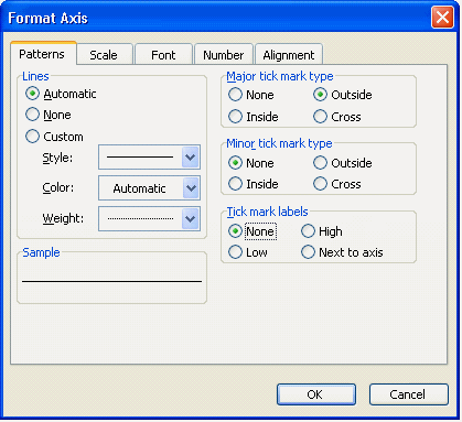
Now format the category axis
to remove the axis labels by setting the Tick mark labels to
None.
|
|
|
 |
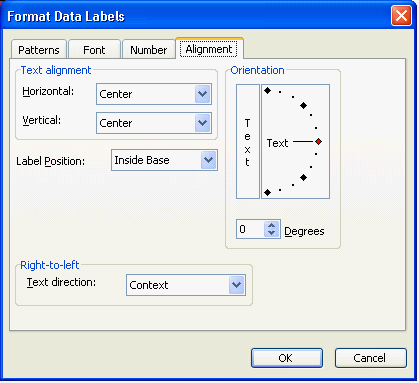
Apply Data labels to the new
dummy series, displaying category name.
|
|
|
 |
Change the data labels
position to Inside Base
|
|
|
 |
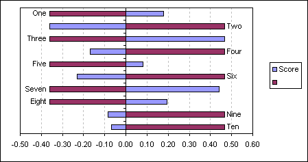
giving you a chart that
displays the category name opposite the bar
|
|
|
 |
Finally set the Pattern Fill
and Border to None for the dummy series. Remove the legend.
|
|
|
|
This technique will also work
with column charts
|
| |
|
|
|
 AJP Excel Information