
| |
| |
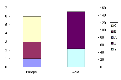
Re: Clustered stacked dual axis chart
|
| |
The stacked cluster chart is
created by though the layout of the data. The dual axis is
simply a case of formatting the required data series to use the
secondary axis.
Here is a example data set
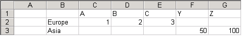
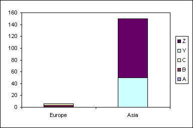
Create a normal stacked
column chart from the range B1:G3
Use the format dialog to move
the data series Y and Z to the secondary axis
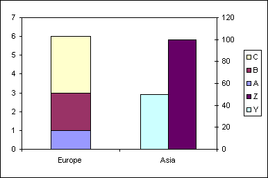
The change the chart type to
stacked column for series Y
|
| |
|
|
|
|
|
|
Created August 2004
Last updated 5th August 2014
 AJP Excel Information