| |
RE: radar chart & labels
Move the axis
labels to the side of the plot area
|
| |
| |
A |
B |
C |
D |
| 1 |
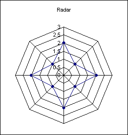
Radar |
|
Grid |
|
| 2 |
2 |
|
-1 |
0 |
| 3 |
1 |
|
-1 |
0.5 |
| 4 |
2 |
|
-1 |
1 |
| 5 |
1 |
|
-1 |
1.5 |
| 6 |
2 |
|
-1 |
2 |
| 7 |
1 |
|
-1 |
2.5 |
| 8 |
2 |
|
-1 |
3 |
| 9 |
1 |
|
|
|
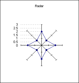
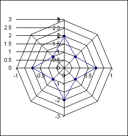
Create a radar
chart based on the range A2:A9
|
| |
Use the Source data dialog to
add an extra data series
|
Change the new data series to
an xy scatter chart and then set the x values to the range C2:C8
and the y values to D2:D8.
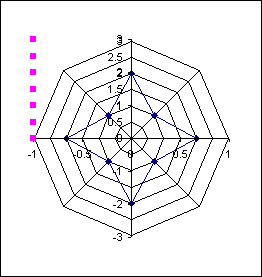
Format the secondary y axis
to have a minimum value of -3 and a maximum of +3
Format the secondary x axis to have a minimum value of -1 and a
maximum of -1
|
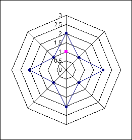
Format the data points to
none. Apply data labels, displaying the y value.
Change the alignment of the data labels to Left.
The horizontal lines are
positive X error bars using a fixed value of 1.
|
Finally finish off the
formatting of the error bars and the value axis of the radar
chart, removing the grid lines.
|
|
|
|
|
 AJP Excel Information