| |
RE: Graph - axis switching for a line graph
|
| |
Unfortunately you can not combine
a bar chart with a xy scatter graph using MSGraph.
So to get the points to appear with the bars you can use a
couple of dummy data series work arounds.column.
 |
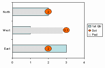
Add 2 extra data series.
Format both to be on the secondary axis and of the stacked bar
chart style.
For clarity I have left the
Pad series with a fill pattern in the finish chart this would be
set to None.
The Dot data series has a
custom fill pattern. To get this I generated a circle using the
Autoshapes and formatted with a fill colour and border. Copy,
using CTRL+C, the autoshape to the clipboard and then edit the
graph and select the Dot series. CTRL+V fill apply the autoshape
as the fill pattern.
Now apply data labels on the
Dot series you will have to manually change the value displayed
to that required.
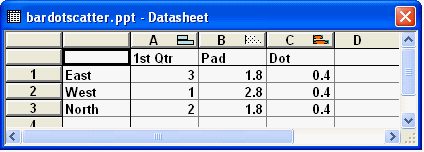
As you can see the values in
the data sheet are not those actually displayed by the data
labels. The Pad values need to be less than the required value
by half that of the Dot value. The Dot value is bit of trial and
error depending on the under lying data and a value that does
not distort the fill pattern. Adjusting the bars gap width will
also effect the value used. Once completed the extra legend
entries can be deleted.
|

 |
| |
|
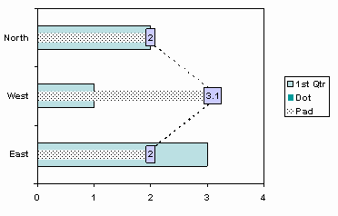
This version uses a similar
technique but this time the bar gap width is set to the maximum,
in order to get a smaller thickness as possible as this will
distort the connecting lines. The values of Pad are now exactly
the values required in order to position the data labels. The
data labels themselves actually belong to the Dot series and
have to be manually edited. The data labels are needed to mask
the fact that the connecting lines do not meet exactly at the
center of the bar but rather at either side of the bar.
|

 |
|
|
If the above is not suitable
then the combination of bar and XY scatter can be achieved by
using an Excel chart.
|
|
|
|
 AJP Excel Information

