There are a few ways you can add
a goal line or band to MSGraph.
They are all constructed in the
same way.
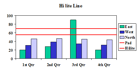
From the datasheet below you
can see the original data for series East, West and North. I
have added a padding series which will be used either as the
bottom line or the data series to pad the hi-lite area or
column.
With the new data series
added to the datasheet you can now update the chart.
Line and Area style
Start by changing the chart
type of the 2 new series, either stacked Line or Stacked Area.
Then move them both to the secondary Y axis. The Y axis should
be set to the same Minimum and Maximum values as the primary
axis. Use the Chart Options dialog to enable the secondary X
axis. You need this in order to uncheck the Crosses between
Categories. With this unchecked the line and area charts will
extend right up to the plot area. Format the secondary X axis so
no labels, tickmarks or lines are displayed. Format the
secondary Y axis the same and uncheck the "Category (X) axis
crosses at Maximum Value".
Column Style
The data set for this need
only include the first value. Then set the 2 series to the
secondary Y axis and the change the chart type to stacked
column. The rest of the steps needed are the same as for the
Line and Area. Notice though that the Cross between categories
makes the first column appear to straddle the Y axis and be half
the thickness.
It is possible
to get the complete by to appear by using advance fill options.
On the Patterns tab press the Fill Effects button and go to the
Pattern tab set the fore and background colour to be the same
and with the aid of what I assume is a bug when MSGraph is
deselected the whole column is displayed.
You can use a value of all of
the categories and then reduce the Gap Width to zero. This will
give you a band similar to the area chart version but the band
will be infront of the columns.
 AJP Excel Information