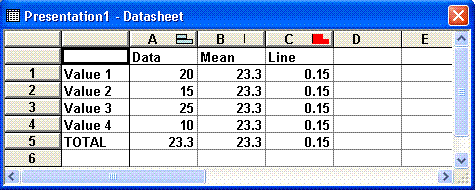
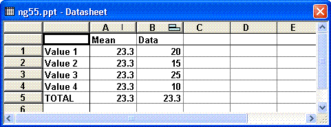
Create a stacked
bar chart and then move the Mean and Line series to the
secondary axis.
Change the chart type for the Mean series to Stacked Bar.
Format the Mean series to have no fill or border and set the Gap
Width to zero.
Delete the Secondary X and Y axis
As suggested by Bill Dilworth
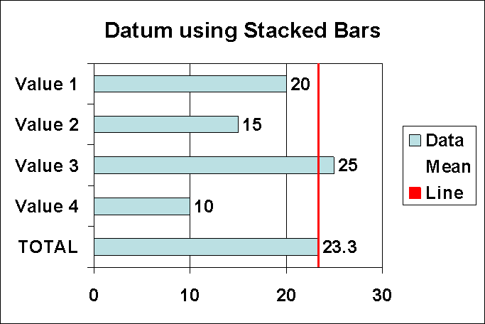
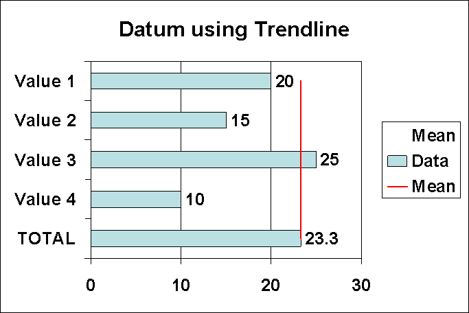
Create a clustered bar chart.
Add a linear trendline to the Mean series.
Format the Mean series to have no fill or border and set the
Overlap to 100.
 AJP Excel Information