| |
| |
Re: Doughnut Chart & Conditional Formats
|
| |
This creates a coloured section within a donut chart depending
upon the month status value.
The valid values are R, A, G or blank.
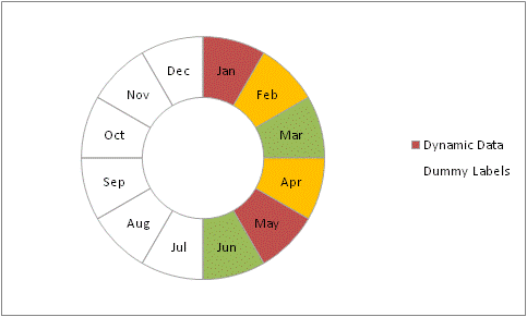
The chart actually has a section of each of the 4 possible
values per month. By using formula the correct data point will
be given a value of 1. The remaining 3 data points will have a
value of zero.
The labels are provided by a series on the secondary axis with a
value of 1 for each month
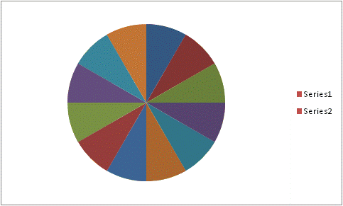
Start by creating a 2 series donut on the full set of data. To
make it easier to format the individual data points used a data
series which consisted of 1's so each of the 4 possible colours
is visible.
Format an individual point by first select the series and then
selecting the data point. Once you format the first data point
you can use the right cursor key to move through to the fifth
data point and use the F4 button to repeat formatting. You will
need to do this for all 4 sets of colours.

Next we need to move the outer series to the secondary axis. In
xl2003 and before you can simply change the series to the
secondary axis. In xl2007 the option is not available via the
dialogs.
To get around this first we need to change the 2nd series to a
Pie chart. Then you can set the pie chart series to the
secondary axis
Add a border to the second series

Reduce the data range for the series to 12 points. Also set the
secondary category labels to the month names.
You can then apply data labels showing category labels to the
series.
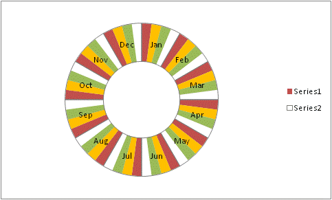
The final step is to change the 1st series data source to that
of the formulas so only 1 in 4 data points are displayed.
The download file contains both .xls and .xlsx files with
instructions.
ng60.zip
 (79kb)
|
| |
| |
|
|
|
|
|
 AJP Excel Information